
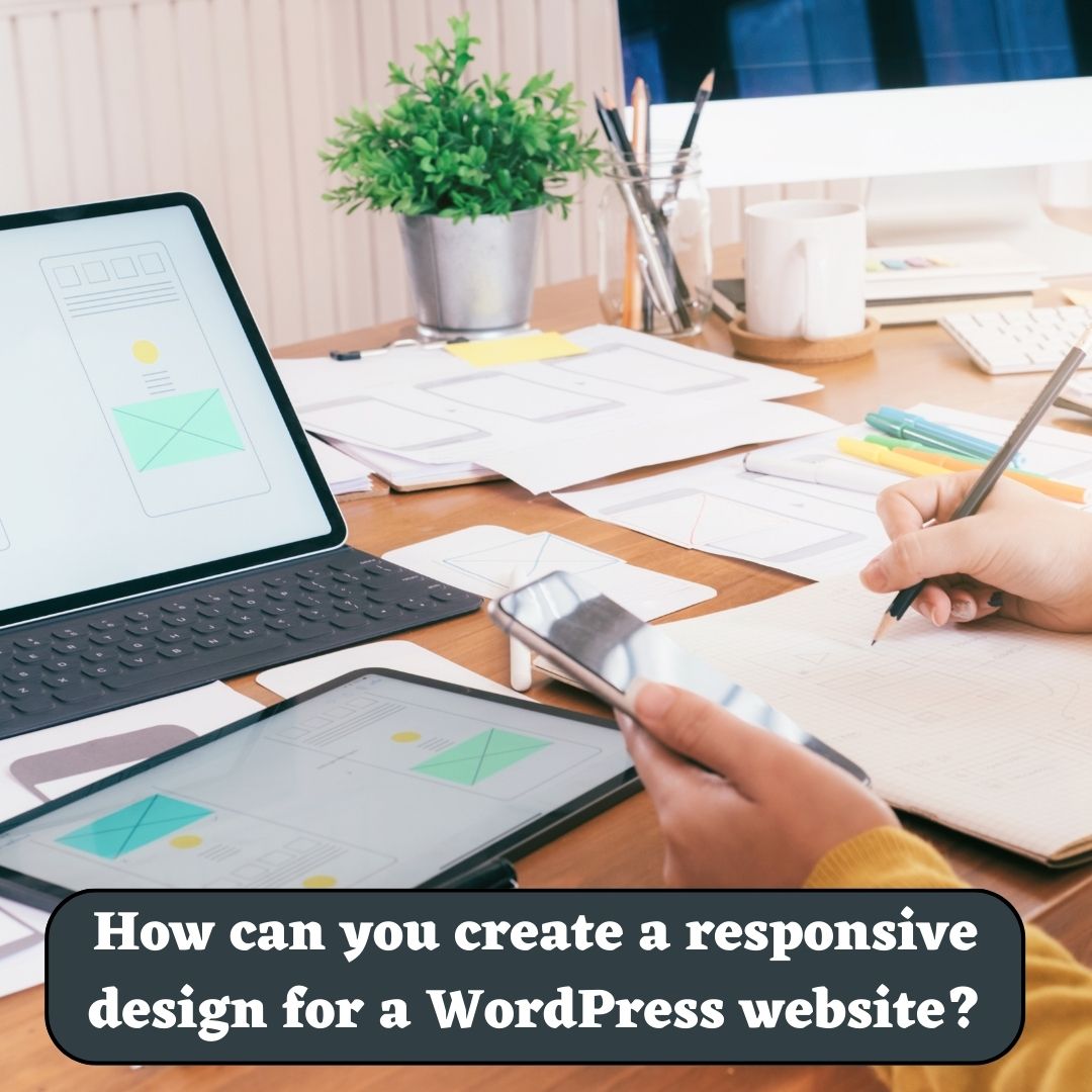
How can you create a responsive design for a WordPress website?
In this article we are going to talk about How can you create a responsive design for a WordPress Website? In today’s mobile-focused world, a responsive design for your WordPress website is crucial. Responsive design ensures that your website adapts seamlessly to various screen sizes and devices, providing an optimal user experience.
How can you create a responsive design for a WordPress website?
In this article, we will delve into the key aspects of creating a responsive design for your WordPress website. From selecting a responsive theme to implementing media queries, flexible grids, and optimizing images, we will cover everything you need to know to make your website look great on any device.
I. Choosing a Responsive Theme
The first step in creating a responsive design for your WordPress website is selecting a responsive theme. A responsive theme is designed to automatically adjust and adapt to different screen sizes, ensuring your website looks good on desktops, tablets, and smartphones. When browsing for themes, look for those labeled as “responsive” or “mobile-friendly.” Take into account factors such as design aesthetics, customization options, and plugin compatibility while choosing a responsive theme that aligns with your website’s goals.
II. Implementing Responsive Design Techniques
1. Fluid Grid System
A fluid grid system is the foundation of a responsive design. It enables your website’s layout to adjust proportionally to different screen sizes. Use CSS frameworks like Bootstrap or Foundation, which offer pre-built grid systems, to create a responsive layout for your WordPress theme. These frameworks provide a grid-based structure that automatically adjusts the placement and sizing of elements based on screen size. By utilizing a fluid grid system, you can ensure that your website’s layout maintains its integrity across various devices.
2. Media Queries
Media queries let you customize CSS styles based on the screen size of the device. By defining breakpoints and applying appropriate styles, you can ensure that your website’s layout, typography, and images adapt to different devices effectively. CSS3 provides excellent support for media queries, making it easy to implement responsive design techniques. Media queries allow you to specify rules for specific screen sizes, such as targeting smaller screens with simplified navigation or adjusting font sizes for better readability. By utilizing media queries effectively, you can create a truly responsive experience for your website visitors.
Read Also: How can you create a contact form on a WordPress website?
3. Flexible Images
Images are important in web design and should adjust to fit different screen sizes. Use CSS techniques such as max-width: 100% to ensure images scale proportionally within their container without overflowing or distorting the layout. Additionally, consider using responsive image solutions like the srcset and sizes attributes or plugins like “WP Responsive Images” to serve appropriately sized images to different devices, reducing load times and improving performance. Responsive images allow your website to deliver the right image size based on the user’s device, ensuring optimal visual experience without compromising performance.

4. Mobile-First Design Approach
To ensure a truly responsive design, adopting a mobile-first approach is recommended. This approach means starting with mobile design and gradually improving it for larger screens. By prioritizing mobile design, you can focus on essential content and optimize the user experience for smaller screens. This approach also encourages a streamlined design and faster load times, benefiting both mobile and desktop users.
Read Also: How to optimize the speed and performance of a WordPress website?
III. Testing and Optimization
Once you have implemented the responsive design techniques, thorough testing is crucial to ensure your website performs flawlessly on various devices. Test your website on different browsers, screen sizes, and devices to identify any issues and make necessary adjustments. Emulate different devices using browser developer tools or consider using real devices for testing.
Optimize your website’s performance by minifying CSS and JavaScript files, compressing images, and leveraging caching techniques. Tools like Google PageSpeed Insights can provide insights and recommendations for optimizing your website’s speed and performance. Additionally, prioritize accessibility by ensuring that your website is usable by individuals with disabilities and compliant with accessibility guidelines.

Conclusion
Creating a responsive design for your WordPress website is essential to deliver a seamless user experience across devices. By selecting a responsive theme, implementing responsive design techniques such as fluid grids, media queries, flexible images, and adopting a mobile-first approach, and conducting thorough testing and optimization, you can ensure your website looks and functions beautifully on any screen size. Embracing responsive design will not only improve user engagement but also contribute to better search engine rankings and increased conversions. Start implementing these techniques today and unlock the full potential of your WordPress website in the mobile era. So, Now I hope you have understood about create a responsive design for a WordPress website.
You can also checkout this website designing institute to learn digital marketing course by enrolling in our course Or Contact Digital Bikana on +91-8949483728